More than 20 years in the works, with multiple schemes and fervid controversy, architect Peter Zumthor’s main building for the Los Angeles County Museum of Art (LACMA) has finally opened. Called the David Geffen Galleries, this ambitious, serpentine concrete structure—which spans over a major boulevard—emerged from a process that was, at times, so fraught that any assessment of its success demands some overview of its tortuous history.
Even before Michael Govan arrived at LACMA, in 2006, as its new director, he was pursuing Zumthor’s ideas for a future building. Govan had worked with the Swiss architect on a (never realized) project elsewhere—and was convinced that Zumthor, with the “sublime and site-responsive qualities” of his designs, says Govan, would be an outstanding choice for LACMA. Five years earlier, the museum had run a competition won by Rem Koolhaas/OMA, with a scheme that remained unbuilt. And then Govan landed on the scene with a vision for a radically different museum experience: instead of organizing galleries—in traditional encyclopedic fashion—by region and period, he imagined a fluid transcultural and trans-chronological arrangement, with few internal boundaries, physically and conceptually. Diverse artworks from different times and places could be grouped around implicitly shared themes, generating dialogue among them. Rejecting linear timelines and a hierarchical, purely Western canon, this more inclusive approach, better representing LACMA’s vast holdings, would allow the museum to show changing selections from its permanent collection as never before—and, ideally, make the work more engaging and accessible to a broader public. It was a curatorial approach with strong architectural implications about space and movement. But vocal critics, architects, and community members bridled at the opacity of the process and key decisions about the new building.
I had my own doubts (and wrote unsparingly about the proposed project along its journey). Certainly I understood objections to the idea that a public (county-owned and -funded) institution’s director could single-handedly select the architect for such a major commission—without a transparent competition or short-list process. Skeptics questioned Zumthor’s track record—though a Pritzker laureate, he had never completed a project of remotely this scale and had a history of cost overruns. There was also concern about his understanding of L.A., as well as the wastefulness and environmental toll of demolishing the existing buildings—three unremarkable, ill-functioning structures from 1965 by William Pereira and one from 1986 by Hardy Holzman Pfeiffer (HHP)—instead of inventively renovating and seismically retrofitting them. Building anew, entirely in concrete, only exacerbated those issues. Meanwhile, costs for Zumthor’s scheme soared to an astronomical $720 million as its interior space—and the programmatic elements it included—diminished. Detractors likened the value-engineered design (which had lost the complex roofline of an earlier iteration in favor of a flat concrete cap) to a highway overpass or road-bridging truck stop.

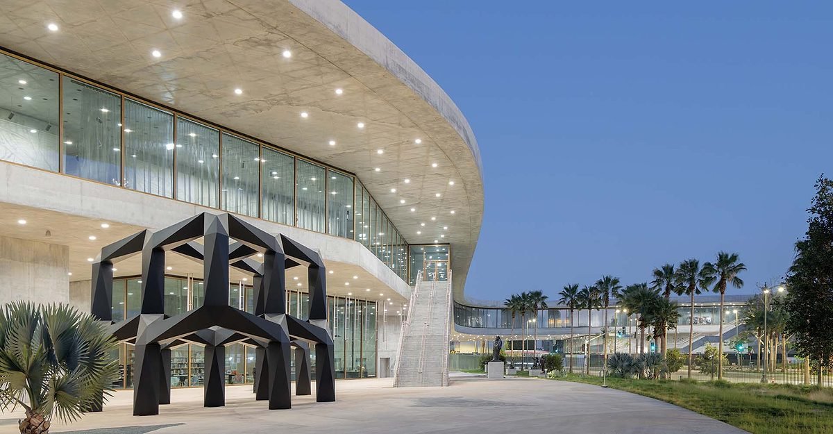
1
Open-air staircases rise to the galleries (1), and the plaza below features artwork (2). Photos © Iwan Baan, click to enlarge.

2
So the stakes were unusually high. Was it worth it? Unexpectedly, my short answer is mostly yes, but at a cost, and not without compromises and trade-offs. Some of the project’s most successful aspects are the experiential qualities from inside, but, in many ways, the interior and exterior are closely related. An elongated amoeba in plan, the 347,500-square-foot museum features a sole gallery level, hoisted 30 feet in the air, atop seven massive supports, or “pavilions.” They house functions including a 300-seat theater, an education center, museum shop, wine bar, and café—some spilling out onto the surrounding plaza, shaded by the building and its deeply overhanging roof. Open-air sculptural staircases rise to the galleries. Between the thick concrete planes underfoot and overhead, a perimeter of floor-to-ceiling glass wraps the entire approximately 900-foot-long upper level. “A single gallery floor was always a given,” says Govan. “It needed to be a continuous flat plane, like much of L.A., able to embrace diversity, with no up, no down, no front, and definitely no back—in other words, no space superior or inferior to any other. And daylight—which now enters from 360 degrees—was essential.” He and Zumthor agreed that this new paradigm required an organic, nonrectilinear form.

The amoeba-like form straddles Wilshire Boulevard. Photo © Iwan Baan
But the scheme didn’t always straddle the major artery of Wilshire Boulevard. That happened after LACMA’s next-door sister institution, La Brea Tar Pits and Museum, raised concerns about encroachment on its paleontological sites, prompting a repositioning of Zumthor’s proposed building. Crossing Wilshire, however, meant extending onto a LACMA-owned parcel on the street’s south side—developable real estate and a potentially valuable income source—which some argue was squandered needlessly, just to bridge the road. But the move does increase the museum’s visibility, with a presence rivaled only by artist Chris Burden’s Urban Light (2008)—a permanently installed forest of street lamps and wildly popular selfie backdrop—just down Wilshire, fronting LACMA’s campus. “The relationship between the new building and the boulevard is about embracing the city’s energy, and that happens in multiple ways,” says Govan, adding that, where traffic tunnels through the structure, an artist’s video installation will play, engaging passersby. Meanwhile, the building’s sweeping curve, bending into LACMA’s campus, conveys some of the speed-evoking drama of freeway infrastructure (of which I happen to be a fan); but the floor plate’s functional flatness, particularly over the roadway, feels anticlimactic, more akin to a low overpass bridge than the exhilarating crescendo of a soaring cloverleaf exchange ramp.
On the gallery floor—which Zumthor has described designing “from the inside out”—vistas across the spaces unfurl cinematically, capturing, against the rhythm of vertical brass window frames, not just the boulevard but also the mountain backdrop, the Tar Pits, Downtown L.A., and Bruce Goff’s previously more hidden 1978 Pavilion for Japanese Art on LACMA’s campus. The city is ever present. Yet Zumthor’s curving floor plate also yields intriguing solipsistic views from one part of the interior into another. This shifting exterior-interior quality is reinforced by the inside-out continuity of the limited material palette of glass, concrete, and brass. The warm-toned metal re-emerges in door handles, stair rails, the building signage, and other fixtures, while the concrete changes according to its architectural role: raw light gray on vertical surfaces, it’s more charcoal colored, speckled with tiny seashells, for the polished gallery floors. Despite such attention to nuance, however, spidering floor cracks and splotchy areas in the roof’s overhang are already visible. (Govan says it’s all by design, that he and Zumthor have embraced the ways nature’s forces register on the materials—and consciously chose inevitable fine floor cracks over expansion joints.)

3
Visitors meander through the serpentine space (3) as vistas unfurl against the rhythm of vertical brass window frames (4). Photos © Museum Associates_ LACMA (3), Iwan Baan (4)

4
Toward the floor’s center are 27 enclosed galleries: rectilinear freestanding concrete volumes of different sizes, a winding neighborhood of small “object buildings.” Inert and self-contained, they play against the flow and openness of the surrounding space. With a single doorway (except where fire code required two), each volume is encased, mausoleum-like, in massively thick walls, minimally detailed, without moldings or door jambs. But the austerity is tempered by interior wall surfaces of deep red, indigo, or eggplant-black, achieved with a saturated yet semi-translucent glaze over the cured concrete. This rich palette recalls the backdrops popularized in classic 19th-century painting galleries (and still present in many traditional museums). Here the intense hues seem equally suited to the old master paintings in some cubicles, the vivid 15th- to 20th-century Tibetan furniture in another, and the regal chaofu, or court robe, from Qing-dynasty China, alone in its own tiny gallery. While many of these chambers admit no daylight, some have a single horizontal slit (or two) near the top, filtering in rays—but the effect falls short of the glowing, mystical qualities at Zumthor’s Kolumba Museum, in Germany. And the more modest, single-door galleries, in particular, can be echoey and feel confining. (I was relieved to escape back into the open expanse.)

5
Toward the floor’s center are 27 enclosed concrete galleries (5 & 6). Photos © Iwan Baan

6
Given how fixed concrete is by nature, it would be hard to ever add onto this building, but the design finds its versatility elsewhere: in the art-displaying potential of nearly every space, whether in the discrete galleries, the interstitial areas, the wide margins along the window walls, or the outdoor plaza below. With the play of shadow and daylight varying across such spatial diversity, the gallery level can address a broad range of light sensitivities or tolerances. Modulating daylight further are adjustable translucent, woven-metal window drapes of varying densities, custom-designed by Japanese textile artist Reiko Sudo. As for the challenges of hanging artwork on concrete (which has been done at museums elsewhere, including the Kimbell), LACMA will precision-drill holes as needed and fill or patch them when the works are removed—here, too, unapologetically leaving the marks and scars of time. “I don’t mind such imperfections and evidence of the human hand,” says Zumthor. “For me, what’s important are authentic materials laid bare—instead of wall board.”

7
Adjustable woven-metal drapes modulate daylight in windowed galleries (7 & 8). Photos © Iwan Baan

8
The gallery level’s broad underlying organizational theme is “Oceans” (Atlantic, Pacific, and Indian, plus the Mediterranean Sea), bringing together work from diverse civilizations around these bodies of water. Without being explicit or heavy-handed, the resulting mix is analogous to the ways different cultures leave their mark, cross-pollinating one another in places like Spain or Sicily.
Many of the displays have an almost tangible immediacy, as in the ancient pottery that sits, with seeming casualness, on uncovered wood-topped tables, as if in the maker’s studio. Zumthor designed everything, from display tables to cleanly detailed vitrines (necessary for certain objects) and long leather-and-metal benches, for relaxing with art or views.
While the unorthodox curatorial-and-spatial juxtapositions might frustrate some scholars and not suit every visitor, the experience of wandering through and chancing upon remarkable works of art and design—including a stunning Louis Sullivan 1894 elevator door from the Chicago Stock Exchange, a Raymond Loewy–designed 1963 Studebaker Avanti, and a Marcel Breuer 1936 bent-ply chaise longue—can be thoroughly engaging. Govan likens meandering along the seemingly infinite, nonprescribed pathways to a stroll in an Olmsted park. Or, put another way, this is a smorgasbord, but not one that trivializes the art. And, while the implicit themes and sub-themes are thought-provoking and visually engaging, it’s not always about a single artwork from one context beside a single one from another—there are also deep pockets of concentration, akin to traditional museum presentations, tapping into strengths in LACMA’s holdings, as in the enclosed volume dedicated to 17th-century Dutch painting.
With 110,000 square feet of gallery space, however, Zumthor’s scheme was long criticized for reducing, rather than expanding, the 120,000 square feet demolished to make way for it. (Govan maintains that the exhibition-space total should include the two relatively conventional Renzo Piano–designed structures on LACMA’s campus—the Broad and Resnick buildings, providing an additional 100,000 square feet—that he strategically completed years ahead of Zumthor’s project, enabling the museum to remain open throughout construction.) Certainly an argument can be made for spatial quality over quantity—and extraordinary objects that often went unnoticed now appear, literally, in new light. But it’s surprising that the flat rooftop doesn’t double as a garden or outdoor display area, or even a place for solar panels (which will reportedly come later). Also, the Geffen contains no curatorial offices and very limited areas for art conservation and storage, omissions that could incur additional expense, inconvenience, and logistical issues.
It’s a little hard to swallow the lack of attention to such key functions in a building with such a breathtaking price tag ($125 million from county coffers, with the remaining $595 million from private philanthropy). Arguably, LACMA could have revamped and seismically retrofitted the Pereira-HHP buildings for a lot less, and accommodated more. “But when I seriously investigated renovating the existing structures,” says Govan, “I could not generate any enthusiasm or interest—believe me, I tried. Raising the funds would have been impossible.” Perhaps, all along, what Govan and the major donors really wanted was a daring and uniquely memorable landmark within the city that would be synonymous with LACMA. And they’ve achieved that—along with a risky approach to presenting art that is likely to succeed. “Much as I admire the Met, that’s not who we are—or are trying to be,” says Govan. “This is definitely something else.” Speaking for myself, I didn’t expect to be enthralled, but I found the art-viewing experience so captivating and pleasurable that I eventually had to be torn away—and can’t wait to go back.
Credits
Architect:
Atelier Peter Zumthor & Partners
Collaborating Architect:
SOM
Engineers:
SOM (structural); Buro Happold (MEP, lighting, sustainability); KPFF (civil); AECOM (geotechnical)
General Contractor:
Clark Construction
Client:
Los Angeles County Museum of Art
Size:
347,500 square feet (including programmable outdoor space)
Cost:
$720 million
Completion:
April 2026